September 5, 2019
How Can the Gestalt Theory Make Your Logo Stand Out?
 Written By Corey LaRosa
The Gestalt Theory may sound like something that requires a calculator and graph paper, but have no fear! The Gestalt Theory doesn’t require any calculations or high-level thinking. This theory can actually revolutionize your ideas about logo design. The Gestalt Theory, developed during the 20th century in Germany by Max Wertheimer, presents five principles for understanding how the human mind naturally seeks to find order amid chaos.
Gestalt, meaning “the unified whole,” is represented by the principles of proximity, closure, continuity, similarity, and multi-stability. Your brain is subconsciously guided by these principles while observing the world around you, and businesses can use this to make their logo memorable. As we dive further into practical applications for each of these Gestalt principles, it will be easy to see how you can create visually stimulating logos that are intelligent and memorable.
Proximity
Location, location, location. Proximity is all about the relative distance between objects in relation to one another. Objects that are close together are assumed to be part of a group. On the other hand, displaced objects are assumed to be alienated. The human brain groups these objects as part of a collection regardless of if they have any actual relation to one another.
For example, any group of children walking together in a schoolyard is assumed to be a class of students. Although this assumption is a safe one, it was never explicitly stated that these students are from the same class. This principle shows how our brain takes cognitive leaps that shape how we see the world around us.
A fantastic professional representation of proximity can be found in the Unilever logo. This logo is a conglomeration of shapes both recognizable and unrecognizable. Although these shapes have no logical relation, our brain sees these shapes like the letter U because of their close proximity. This creates a rather simple logo with a deeper level of complexity. This allows Unilever to deliver a very logical logo with a complexity that adds whimsy and creativity elements.

Closure
The principle of closure is a simple, but powerful principle that revolves around the idea of two or more shapes coming together and creating something new in the negative space. The brain tends to notice the obvious structure of the shapes first and then catches on to the hidden shape over time. This execution has the strongest effect when the hidden shape communicates something powerful about the brand.
The international shipping empire, FedEx, employs closure very intelligently in its logo. At first glance, the vibrant colors and strong text of the FedEx logo set a powerful standard for the brand which inspires trust and confidence. Alone, this would be a serviceable logo that could become iconic after a couple hundred thousand marketing dollars. However, if you look deeper, there’s another shape hidden in plain sight! The letter E and the letter X join together to create a rightward facing arrow. Arrows in the design represent speed, progress, and forward-thinking. An arrow is a powerful shape to associate with a brand that is focused on cross-continental package delivery. With just a little ingenuity, FedEx has turned an average logo into an incredible and recognizable communication tool. The beauty is in the simplicity.

Continuity
Continuity is all about natural flow. Rivers have continuity as they ebb and flow, yet every twist and turn feels cohesive. This sort of experience in a logo drags the eye along and demands the brain’s attention. Continuity truly comes to life when your brain sees a logo as a unit rather than a sum of letters or parts.
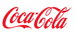
The best example of continuity is found in a brand that has affected humans around the world: Coca-Cola. This logo takes continuity to the highest level and expresses it in the logo’s color font and even capitalization. Even though “Coca” and “Cola” are separated by a hyphen your eye moves across the logo fluidly. The principle of continuity is also the reason that the brand “PetSmart” is read as “Pet Smart” and not “Pets Mart.” Continuity brings a unique level of clarification to a logo that makes it feel clean and brings a high level of professionalism to the table.

Similarity
Think about the twins which you could never differentiate from elementary school. Without knowing anything about them, you knew they were related (or even thought they were the same person!) This is the Gestalt Theory in action. Our brains take the liberty of assuming that anything with a similar design or properties must be related.
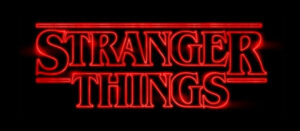
A relatable example of this is seen when people borrow typography styles from television shows to advertise personal events like birthday parties. For example, if you received a party invitation that employs the iconic typography style from Netflix’s “Stranger Things,” you would know that the party’s theme right off the bat even though it was never explicitly stated. Businesses employ this same strategy to create a sense of cohesion throughout their brand including everything from the colors to the shapes they use.
eBay does a fantastic job of exercising the principle of similarity throughout their brand. This is evidenced by a simple test we’d call the “Random Page Test.” If a random page was shown to a person from the eBay website while keeping the actual logo hidden, the majority of people would be able to guess the company with no problem. This is because eBay has been extremely intentional about keeping their brand style similar and consistent throughout their entire experience. From start to finish, guests interact with warm pastel colors and round sans serif fonts. It’s this sort of similarly that turns a brand from unrecognizable into a household name.
Multistability
Since the dawn of man, humans have found ways to share important images with one another. This started with simple carvings and cave paintings, however today we see this principle through the sharing of viral images through social platforms like Facebook, Instagram, and Reddit.
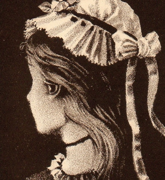
Multistability logos tap into this sense of intrigue by flirting with the idea of optical illusion. The young/old woman illusion is a strong example of how the mind can trick itself and see two completely different things in the same image (see below). It creates a sense of wonderment in the viewer that causes their brain to linger on the idea and even want to share it with those around them to get their perspective on the image.
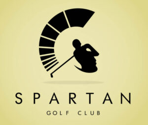
Implementing this can be a real challenge to pull off because it requires a unique level of creativity, however, when it works the results are incredible! A great example of this is seen in the golf brand, Spartan. The image seen first is relative to the individual’s brain, however, this logo very clearly features two detailed images. The first pictures a golfer mid-backswing, while the second image features the side profile of the iconic Spartan warrior’s helmet.
This effectively allows the brand to have two logos for the price of one. For Spartan specifically, the image of the golfer strongly communicates the function of their brand while the Spartan strongly communicates the essence of their brand. By leveraging the power of two logos in one, it allows you to communicate not only brand purpose but even brand tone through one visual device.
The Gist of Gestalt
The sky’s the limit with the Gestalt Theory. It is possible to employ one or more of these principles in any logo. However, some are certainly harder to pull off than others. The biggest advantage of using these principles is that it gives your logo sticking power. It makes the thing that represents your business fun, thoughtful, and memorable. That is why building brands and crafting logos that speak to their true uniqueness is one of our favorite things to do at PHOS. In this day and age where business names aren’t always as cut and dry as “Bill’s Painting,” it’s important to have a logo that is just as special as you are!
Corey LaRosa
Corey serves our clients by helping them achieve their maximum potential and cultivate powerful ideas into actions that multiply their purpose. His greatest joy is digging deep to tap into wellsprings of passion and guide that passion toward accomplishing previously untouchable goals.
When he’s not drinking copious amounts of coffee, Corey can be found on Discord bonding with his friends while playing video games, downing a burrito bowl at Chipotle, or petting all of the foster animals at PetSmart.