The Brief
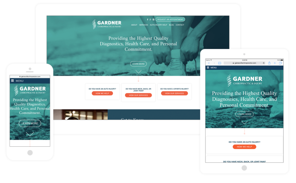
When Dr. Gardner decided he was ready to open his practice, he came to PHOS for our full scope of branding services inclusive of a logo and website design to support his athletic, energized tone for the company. Our task was to communicate the story and balanced approach to spinal health that Dr. Gardner had made the forefront of his mission.
Our team wanted to incorporate athleticism in the design while also positioning Dr. Gardner as the experienced, well-read expert that he is. That expertise was to be shown through beautiful, authoritative design, and expert content throughout the website.
After much research, inspiration, and planning, the results not only gave Dr. Gardner a platform to tell his story and reach his customers, but was designed in such a way to be inviting and easy to use for all visitors.

An Award Winning Identity
The industrial spinal icon symbolizes a balanced approach to spinal health and overall wellness. The movement of colors and lines offers an energetic and athletic feel, while the font communicates strength and trust.
By incorporating an industrial feel to the logo along with photography and gradients to the website, we were able to achieve our goal, leaving an easy to use website and proud client.
Dr. Gardner and his team were not the only people to love this design. The Gardner logo AND website were both recognized by the American Advertising Federation, winning Silver ADDY Awards for logo design and B2C website design.
The PHOS team felt Dr. Gardner’s passion for life, people, and health, and told his story through beautiful branding, website development, and compelling messaging. Our deliverables have resulted in Gardner’s improved ability to attract new customers, nurture leads, and grow Dr. Gardner’s passion and future.


