The Brief
Hopkinton Christian Preschool (HCP) has provided childhood education and care for Hopkinton Massachusetts and the surrounding communities for the past 30 years as an offshoot of Faith Community Church. Their focus is on serving entire families and giving students a foundation of faith, as well as confidence and excitement for school.
HCP came to us because their old website was not providing families with the information they needed. HCP administrators had to use paper registration forms, and there wasn’t a straightforward way for parents to get the information they needed about tuition, the HCP facilities, or education. There was also a challenge to give HCP a fresh, fun look that didn’t mirror exactly or clash with the Faith Community Church site.
What We Did
Our Vision
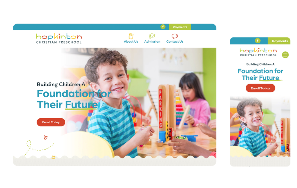
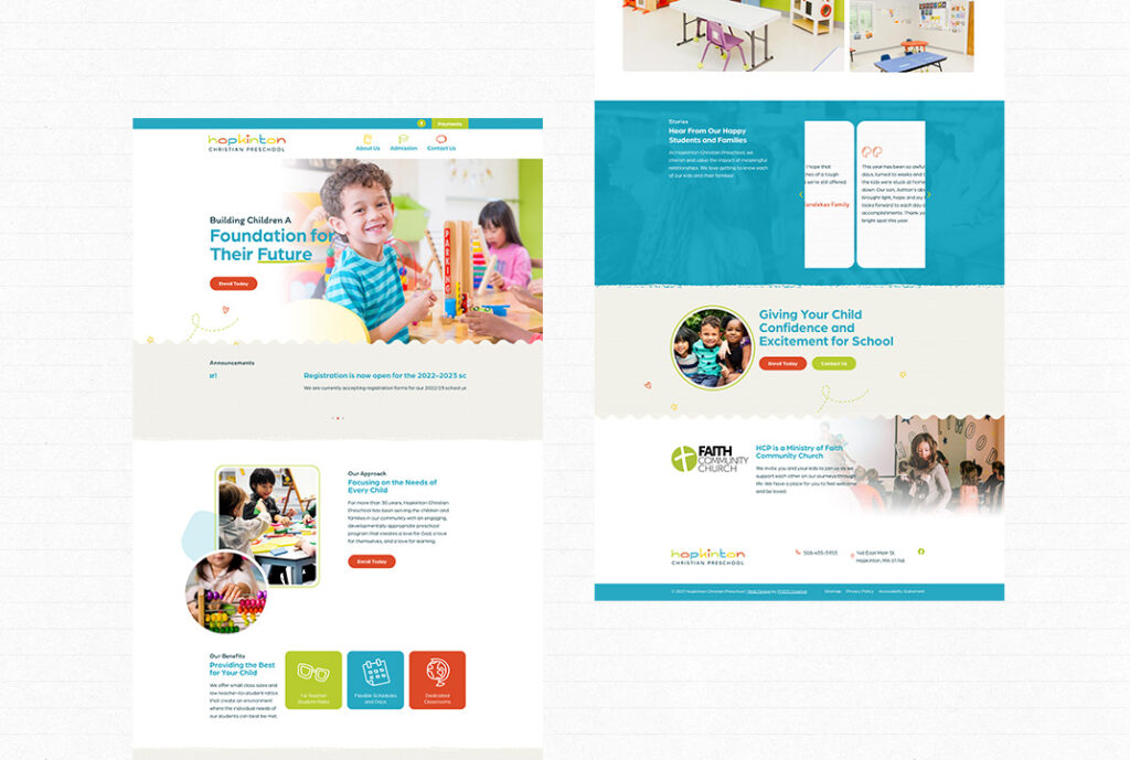
With the new HCP website, we wanted to create a brand that appealed to children and families alike, conveying the high-quality education students receive with the love and care HCP staff and administrators lead with daily. We created a beautiful new website that showcases the HCP difference to current and potential families.

Competence
HCP is not just a daycare but rather is a state-accredited educational establishment using a renowned faith-based curriculum taught by excellent teachers. Students become prepared for elementary school and develop a lifelong love of learning they carry with them throughout their education because of HCP’s foundational teaching. The new website demonstrates HCP’s experienced teachers and their passion for educating students during their entire time at HCP.

Faith
HCP is a faith-based preschool that caters to families from various religious backgrounds, and one of the things the administration is proudest of is that children often use what they have learned at HCP to encourage their families to learn about and accept faith for themselves. We wanted the website to showcase HCP’s faith component while also not alienating the unchurched, which we achieved through an intentionally delicate balance of faith-based language.

Fun
A preschool website shouldn’t be boring. It has to relay the information families need to make informed decisions about sending their kids there, but it should also tell the true story of what a student will experience. HCP is a seriously fun place for kids and families — bright colors, engaging spaces, and loving staff. We wanted the new website to reflect HCP’s unique energy and make it clear HCP is a place children will want to be as they learn and grow.


The Strategy
We were excited to develop a comprehensive but engaging website for HCP. After our strategic meeting with the HCP team, we got to work implementing our strategic plan.
- Custom sitemap development
- Custom designed-builder constructed website
- Digitized registration forms
- Platform flexibility for future content insertion

Web Design
HCP’s previous website lacked much of the information families need to make an informed choice about where to send their children for preschool. The HCP landing page was confusing and unengaging, and there was no clear user journey mapped out. HCP’s new website is user-friendly and welcoming, reflecting HCP’s commitment to loving and caring for the families it serves. Families can access a FAQ page to answer their questions, can submit electronic forms for a more streamlined process, and view colorful, fun pictures of the HCP facilities before they ever step foot on campus.


