With an educational background in Industrial Design, Cat brings a little bit of everything to the team as PHOS’ first Creative Associate. She delivers research and user-based results, whether that be in a new branding campaign or your next photoshoot.
June 12, 2018
Case Study: Small World Travel Agency | How to Approach Campaign Visuals
Last month we presented the webinar The Campaign Mindset: Focused Messaging for Effective Digital Marketing that walked through how to persuasively tell your brand story with campaigns.
Because campaigns are heavily visual, we wanted to spend some more time diving into how to strategically think about campaign graphics.
We’ll look deeper at the mock company we used in the webinar, Small World Travel Agency, to understand the graphic design choices made.
Last month we presented the webinar The Campaign Mindset: Focused Messaging for Effective Digital Marketing that walked through how to tell your brand story with campaigns persuasively.
Because campaigns are heavily visual, we wanted to spend some more time diving into strategic thinking about campaign graphics.
We’ll look deeper at the mock company we used in the webinar, Small World Travel Agency, to understand the graphic design choices made. Small World Travel Agency is a boutique travel agency that offers curated travel packages to people looking for unique and authentic experiences around the world. They recently added Japan travel packages to their services and needed a campaign to get the word out.
Define Your Campaign Cornerstone
To briefly recap, a “campaign cornerstone” is an overall idea that anchors your campaign. This is your reference point to check all messaging and visuals against.
The campaign cornerstone should sound like your brand with a focused message that supports your campaign’s goal.
We looked at their mission & campaign goal to define Small World’s campaign cornerstone. Their mission is to offer the best authentic experiences to travelers so they can fully immerse themselves in another culture. Their specific goal for the campaign is to create awareness for their new travel packages to Japan. With those in mind, we arrived at:
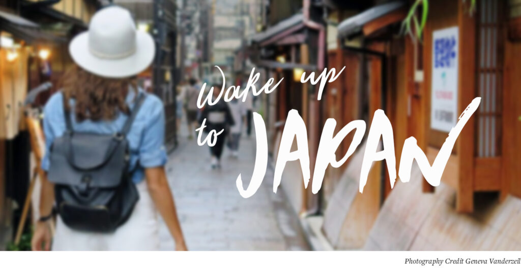
This phrase represents Small World’s goal of introducing people to adventures they haven’t seen or considered before. The messaging is short, with familiar phrasing to pair well with the evocative imagery.
All messaging and graphics will tie back to this idea of putting viewers in an experience. This helps differentiate Small World’s campaign from the typical, sweeping landscape views of traditional travel ads.
Use Photography & Color Palettes to Support Each Other
The Small World Travel Agency brand has a simple color palette as their website and marketing rely heavily on photography. A paired down, neutral color palette allows them more flexibility with regards to using different styles of photos in their day-to-day marketing.

For the “Wake Up to Japan” campaign, Small World centered their color palette around the classic, Japanese, vermilion hue. As we can see in these Facebook ad mockups, they let the colors come through with their photography choices.
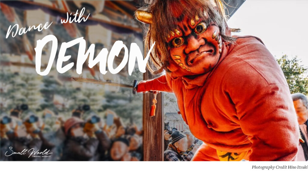
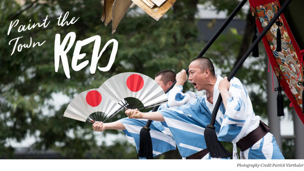

These photos have a consistent palette of red, dark browns, tans, charcoals, and greys that pair perfectly with Small World’s brand palette. With so many colors coordinating throughout the set, the occasional extra color (like the blue robes) feel refreshing instead of jarring.
Note that your campaign color palette does not have to exactly match your usual branding color palette, but there should be some thread of consistency between your usual branding and your campaign. For example, if your brand uses bright, primary colors it will look inconsistent for a campaign to use deep, muted tones.
If you’re not sure if your photo sets go together, have them all displayed in front of you and ask yourself if it looks like the same photographer took the photos. Pay attention to the angle of the shots, the color balance (do the overall colors read yellow, blue, or true-to-color), and framing.
Another trick is to squint at the photo set. Are similar colors jumping out at you or do you get a hodgepodge of different tones? What if you put the campaign photos on your website? Do they look at home or out of place?
Working with a photographer or creative director who knows your brand and campaign can help you tell a consistent, visual story.
Select Typography with Personality
It’s easy to understand what a photo is trying to say and disproportionately allocate time to picking the perfect shots over the other campaign elements. Without getting too into font theory, know that the typography you choose is one of the core elements to campaigns, and ultimately branding.
You can choose to stick to your usual brand fonts (Spotify uses the same heavy, sans serif font on their website and in every ad they have ever published) or find analogous fonts that compliment your brand for a chance to push your usual style.
Small World Travel Agency typically uses a combination of a modern script font with a traditional serif to convey their modern approach to a traditional industry. Their usual font pairings are more reserved than this campaign calls for, so we went with the analogous path.
The contrast of types in their logo has a lot of personality, so we wanted a similar contrast for the campaign. The bold, thick brush font (as seen on ‘Demon,’ ‘Gourd,’ ‘Red’) nods to Japanese calligraphy and is balanced out by a thinner script font that feels familiar to Small World’s logo.
Just like when you select a campaign color palette, you can play with new iterations of your brand and long as some elements are similar to your core branding.
Implement Visual Consistency Across Platforms
Designing campaign graphics for your primary platform first (Facebook, display ads, etc.) then modifying them for the secondary platforms can help focus the style of the campaign without pulling you in too many directions.
Once the primary platform graphic is created, carry over the main elements to the other graphics. For example, the ‘Wake Up to Japan’ campaign was primarily going to use Facebook, so we started with their 3 Facebook ads. From there, we designed an email mailer and display ads that use the same photography, photography, & messaging. Each platform will require their own add-ons, but if you keep the core elements the same it will all feel cohesive.
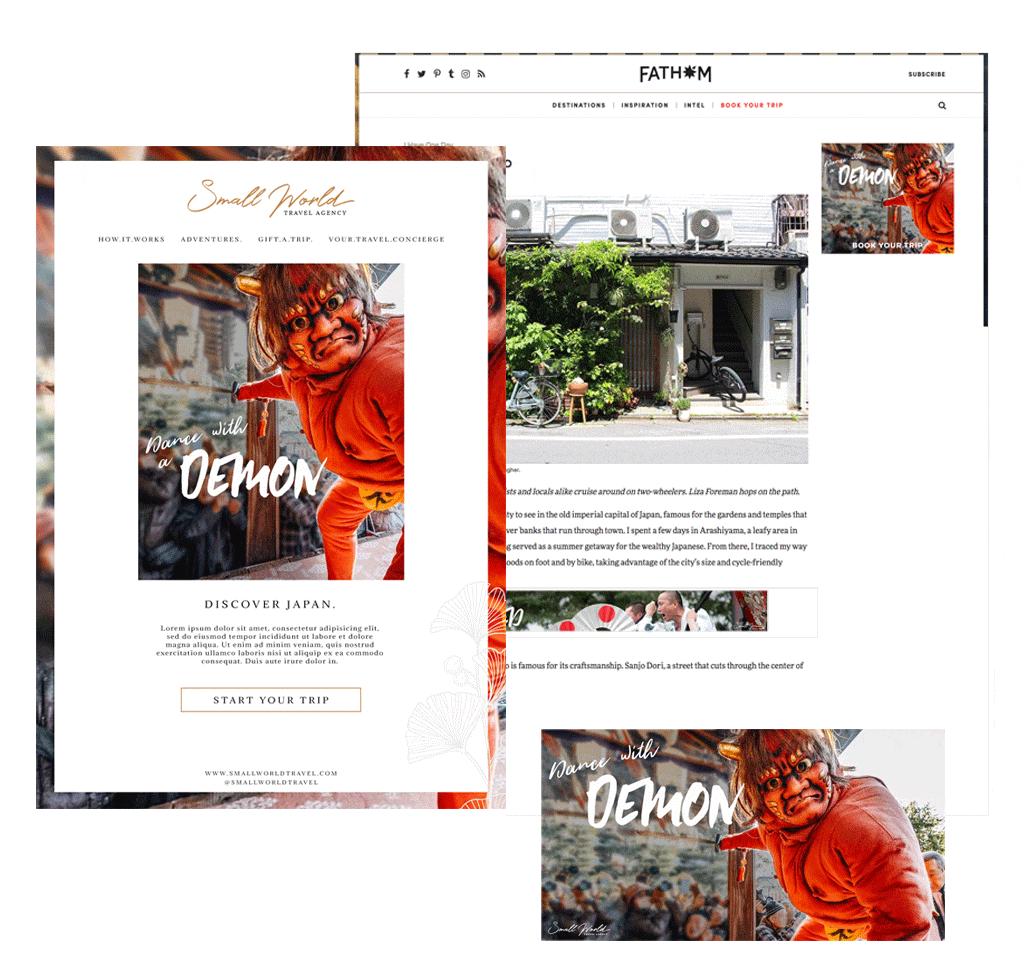
Campaigns are a great way to deep dive into your brand story and deliver a more complete message than any individual piece of marketing material.
If you’re interested in using a campaign to further your marketing efforts, make sure to check out the full webinar for a holistic approach to planning campaigns and sign up for our newsletters for updates on upcoming webinars.


