February 16, 2024
How to Build a Powerful College Website
 Written By Jenelle Kruse
Updated February 2024
Picture this: a high school junior is in an office with an academic advisor. She’s not sure where to apply to school—she knows the big public institutions around her, but she doesn’t know all the options available. The advisor mentions a few with good programs in areas the student is interested in.
As soon as the student walks out of that office, she’s on her phone looking up the college website.
Beyond TV commercials or college fairs at high schools, a college website is the single most important piece of marketing the college has.
Table of Contents
- History – How Far We’ve Come
- Creating a Plan
- Content Architecture and Development
- Web Design
- Web Development
- Managing a College Website Post-Launch
History — How Far We’ve Come
The concept of higher education itself is long and storied—in the US alone, the schools of colonial times would be nearly unrecognizable from the research-driven, economy-driving institutions of today.
The web’s heritage is much shorter, but with the rate of innovation driven by new technologies and increasingly creative uses for existing technology, it has plenty of history of its own.
Higher education institutions were some of the first adopters of the World Wide Web (W3, as it was referred to). It was no surprise to see Stanford, Ohio State, and University of Birmingham leading the way in the early 1990s with the first college websites.
Of course, when we look at some of these early adopters of modern technology, some of the looks are… well, less than modern.
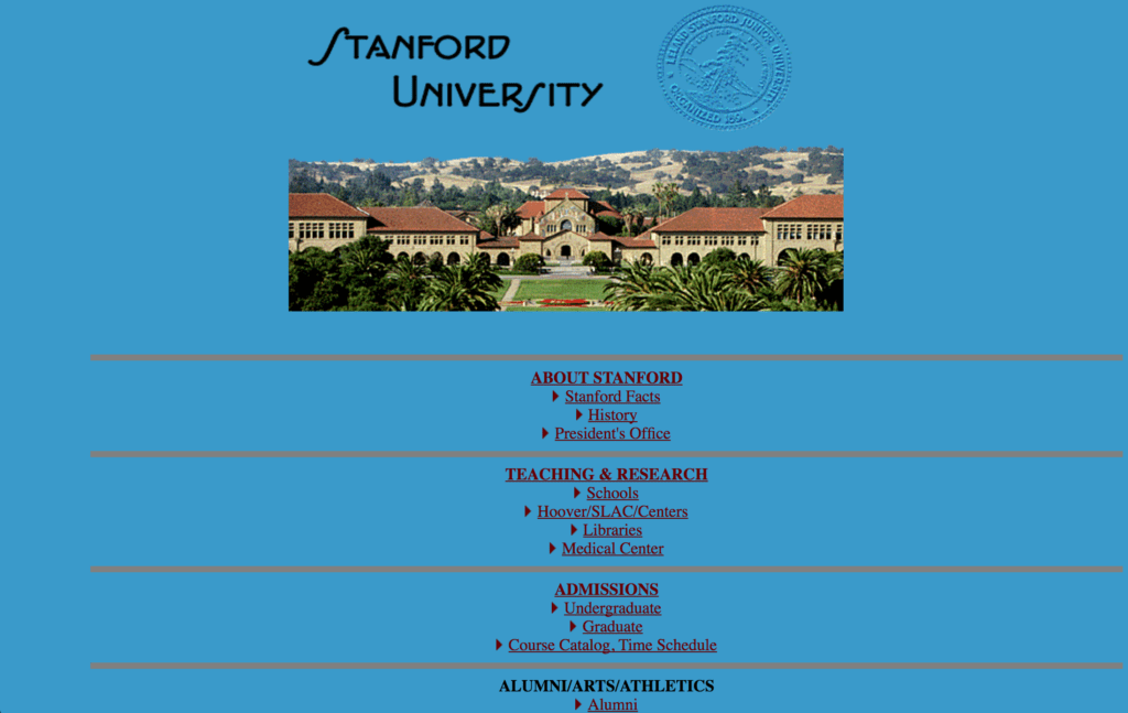
This is the digital presence of the illustrious Stanford University in 1996. We’re not quite sure where the handwritten-style Eaglefeather Bold version of the logo came from, but hey, it’s unique!
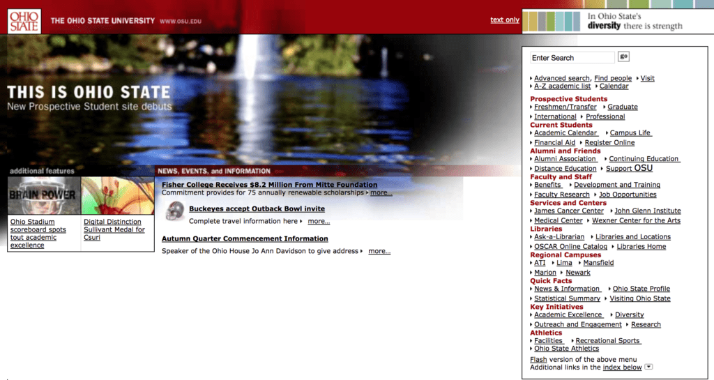
Here at the turn of the century, Ohio State was on the front lines of a new trend toward condensing navigation into one spot, to focus on visuals with the rest of the screen real estate. The website even includes updated news and events—a signal of more than just a static site.
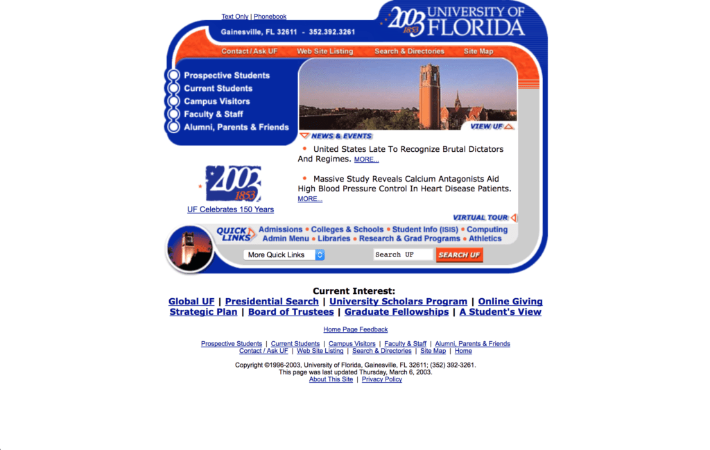
Since we call Gainesville, Florida, our home, we couldn’t help but check out what the University of Florida used to look like. UF celebrated 150 years with this… gem in 2003.
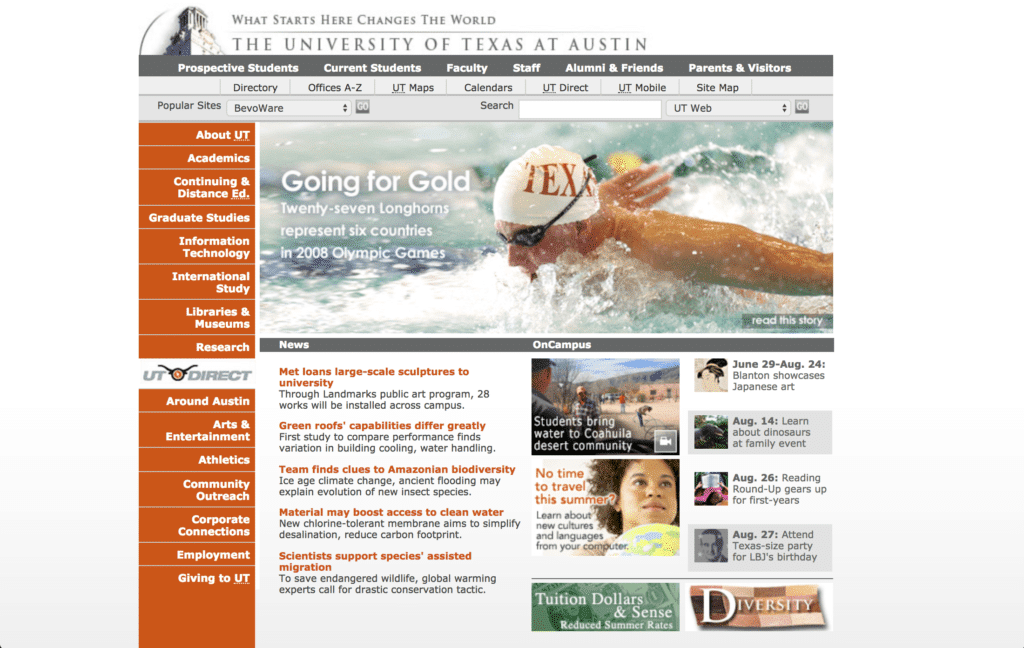
In 2008, the University of Texas gave us an example of design and structure moving closer to what we might call modern style for that time—somewhat clear sections and a step towards better-organized information through both top and sidebar navigations.
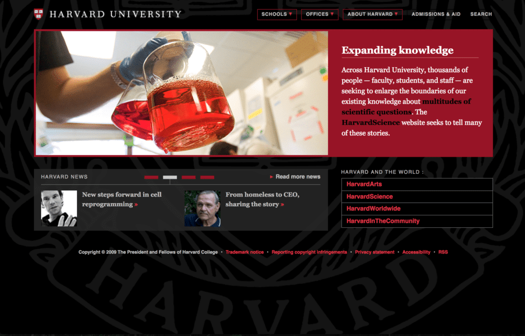
Harvard, which lays claim to the title of the oldest institution of higher education in the United States, boasted this website in 2009, including a large background image of its well-known seal. It may be interesting to note that one of its most well-known dropouts, Mark Zuckerberg, had already created a similar-looking homepage for Facebook at the time.
Now that we’ve explored the history of college websites, it’s time to chart the course for the future. Let’s look at strategies to help build a college website that truly connects with today’s prospective and current users.
Creating a Plan
A little planning goes a long, long way.
Any successful website is built around a plan—way before there’s even a single discussion about design or features.
One of the biggest reasons we see a need for an education website redesign is an overgrown website.
We wrote about this when we discussed how we create a sitemap for a new website, but it bears repeating here:
Often, different departments each want to add pages for different subcategories of content that they think merit their own home. That, and everybody wants to be on the homepage.
The result is the shell of a once beautifully-planned structure that’s been bogged down by more and more content placed in the wrong spots by people with entirely good intentions.
Sound familiar?
It’s not a problem that’s specific to academia. As an organization grows, as new initiatives are launched, as new services are added, websites can get bloated or lack organization in their pages, content, and user experience.
It’s easy to let this happen at larger organizations where different departments create too many hands in the pot without a plan to guide them.
So what does that plan look like, and how do we put it together?
Understand Your Audience
To enhance the effectiveness of your college website, you’ll first need to gain a deeper understanding of who is currently using your website through a comprehensive approach that encompasses qualitative and quantitative research. Our strategy at PHOS involves leveraging tools such as Google Analytics to meticulously analyze your current website’s traffic data.
We’ll assess things like:
- The number of unique visitors and where are they coming from
- How long visitors stay on a page
- How quickly visitors leave a page
- The number of pages viewed per session by visitor
- Audience demographics
- Most visited pages
- Page conversion rate
While analyzing overall website traffic is crucial, it’s only the first step. To personalize the user experience and cater to different needs, we need to organize your audience into unique user groups.
Let’s dive into who these groups are and what motivates them.
Identify Your User Groups
User groups are similar to buyer personas. They’re the people who you expect to use the website, the people who currently do, and the people you want to.
They’re distinct from buyer personas in that they tend to have more diverse goals. Whereas buyer personas have distinct needs all served by your product, user groups interact with your brand in a variety of ways.
For an education website, these might include:
- Prospective students
- Influencers of prospective students (such as their families)
- Current students
- School advisors
- Faculty and staff
- Community members
- The press
That’s a short, general list, but you may make yours much more detailed.
Once you’ve identified your user groups, identify your 3–4 primary ones. “Primary” may be tied to your institution’s strategic goals. Then brainstorm, research, consult, and record answers to these two questions for each group:
- What are their goals?
- What are your goals for them?
Their goals are specific content that they need to be served with. Prospective students may need to find a list of programs and study abroad opportunities. Current students may look for class scheduling and a sample four-year plan. The press is looking for statistics, statements, news, and contact information.
Your goals will again be tied to something higher, such as a strategic plan. But it will also be closely tied to the user group’s goals. After all, no matter what, the primary focus will always be serving users with the content they want in the format they want it.
Why Audience Is the Most Important Element of Your Story
Knowing your audience is key to good a good story. Recognize that your audience is made up of individuals, and begin to strengthen your brand.
Conduct Surveys
It’s possible to put together a good plan by simply thinking about how website users think—but unless you go directly to the source, you’ll never be certain. The worst thing you can do is build an entire, multi-faceted digital experience around an assumption.
Qualitative surveys are great ways to test hypotheses, challenge assumptions, and gather open-ended data straight from the source. Ask multiple members of your different user groups why they use the current site, what content they look for, what’s important to them, and how the site is failing to meet their needs. Gather a lot of data, and use that to modify your plan.
Content Architecture and Development
Once you have a comprehensive view of your users and goals, it’s time to plan the content. Remember, the goal of defining user groups is to define how to best serve them—that means creating content that the user group wants and/or needs. An aesthetically pleasing college website design without an easy-to-find list of programs is useless, meaning content architecture is vital for success.
Have a Clear Organization
Think about the way we speak about a website project. Typically, we say we’re building a website. The building process, when we talk about something physical, typically involves gathering a list of wants and needs, putting together a blueprint, creating mockups, and then executing the project based on the previous steps.
Websites work the same way. Crafting a sitemap is the website equivalent of a blueprint. It defines how everything is laid out and organized.
At its most basic level, a sitemap looks like this:
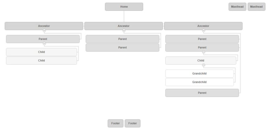
Not the most glamorous chart in the world, but it’s a blueprint.
At a high level, the steps to creating a sitemap that organizes content well and serves users are:
- Auditing existing content.
- Grouping content based on subject matter.
- Prioritizing content based on importance to your users.
We typically have two or more different directions on how to organize content before we decide on one. Getting feedback and perfecting organization at this stage is important because it lays the blueprint for everything to come.
How We Create a Sitemap For A New Website
Creating a sitemap involves up-front planning, strategy, and insight into the user’s mind. Here’s how we go about creating a sitemap for a new website.
Define a Messaging Strategy
One question we always ask clients is if they have a defined messaging strategy in place.
You should.
As the college’s brand grows—both in its usage in a new digital environment and in the minds of its audience—it is essential that everything speaks with one voice. A consistent and coherent brand delivers a strong, clear message at every touchpoint.
We always want to know if there are any external campaigns the website’s messaging needs to tie into—recruiting, fundraising, research, or marketing for anything else.
If an institution doesn’t already have a messaging strategy, we help create one. This is another opportunity to use qualitative surveys and various other means of research. In the end, a complete messaging strategy includes:
- What the school does, how it does it, and why
- The brand positioning
- The brand narrative
- The brand attributes
- Writing goals and principles
- Voice and tone
- Key messages
- Grammar and mechanics
Consider Content Format
One of the most engaging forms of content today is video. The possibilities are endless—from recruiting and informational content to welcome videos and even a digital tour of a dorm room.
Consider how alternative formats may better suit specific content.
Find Some Fast Facts
Students have a lot of options when applying for colleges, I mean a lot. What is your school doing to stand out?
Make the uniqueness of your institution immediately clear, and put it in metrics. Colleges that can grab attention with easy-to-understand differentiators stand out in the crowd.
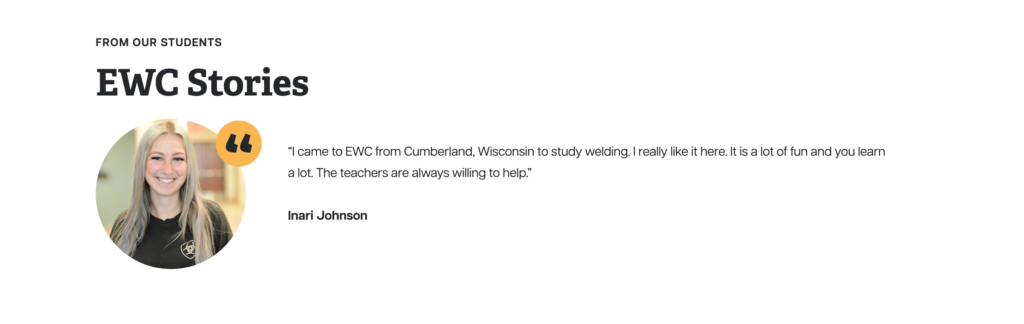
Use Social Proof
Your TV commercials and digital ad campaigns highlight your campus’s culture—why should your college website be any different?
Tell the stories of your students, faculty, and community members. Gather powerful experiences and feature them!
Web Design
The plan is set. The sitemap is set. Now comes the fun part: design.
Design gets all the glory, and for good reason. I don’t need to tell you the value of design—how it impacts how people feel, where they look, and how they consume information.
Every single college, university, or other educational institution has a distinct brand, and no two websites will ever be alike. For that reason, instead of diving into creating an on-brand website, here are five big points of consideration in the design phase.
Declutter, Declutter, Declutter
As we talked about before, an overgrown website becomes a huge issue when users are trying to scroll through. That applies to design as much as it does to content architecture.
White space provides direction and gives the user something to focus on.
Ah, sweet clarity.
Choose High-Quality Photography
Photography is one of the most common ways to “show them, don’t tell them.” Photography can say anything you want to, and much more powerfully than words. It can say professionalism, lifestyle, celebration, innovation, and more. The trick is defining what it should say.
Particularly with the generation coming into college now, they want to be able to picture themselves at the college. High-quality photography is no longer optional—nothing drives a student off of a site like low-res, poorly cropped, or otherwise low-quality photography.


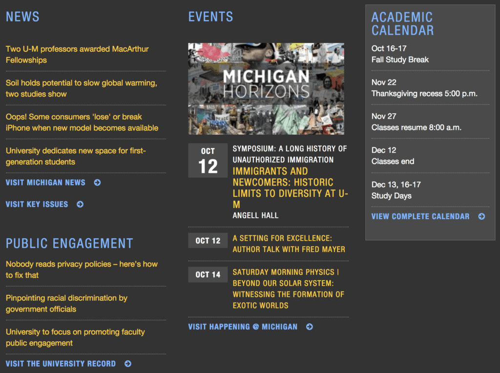
Keep Navigation in Mind
A college website, no matter the size, has a lot of content. With such a diverse set of users and so much important information for each of them, making that information accessible is crucial.
This goes beyond just organizing content well. It has to be easy for users to find and access.
No, that does not mean stuff all 600 pages in the navigation. Rather, use consistent visual cues in several forms—main navigation, potentially a second navigation bar, sidebar, footer, or any even more in-page navigational elements on important pages.
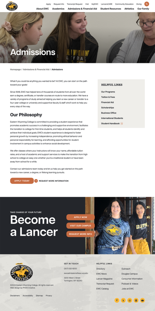
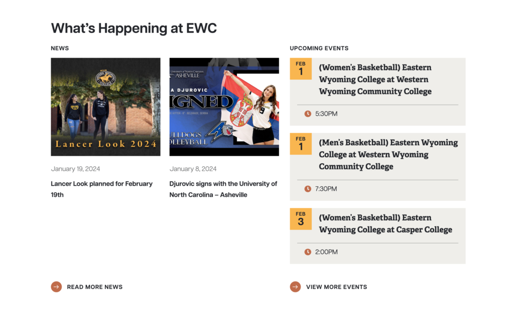
In this example from Eastern Wyoming College, you see the masthead navigation, search, main navigation, sidebar navigation, footer links, and three footer CTAs—all without being overwhelming.
Focus on Mobile
Remember our high school junior from earlier, who started looking up colleges on her phone?
The ones that don’t offer a good mobile experience frustrate her, and she leaves within seconds. The ones who are easy to use on that phone stay in consideration.
That’s how users in just about any group use the web, and with today’s current and future students who are researching colleges, that’s not going anywhere.
Accessibility
The more accessible your website is to users, the more people will understand you more easily. Web accessibility isn’t about disability—it’s about universality.
There are four principles of web accessibility. A website must be:
- Perceivable
- Operable
- Understandable
- Robust
Besides being a good idea overall, web accessibility can become legal for educational institutions. For that reason, there are considerations that help make a website usable by all users such as:
- A strong contrast between font colors and background color.
- No text as images.
- Disabling autoplay ability on sliders.
- Providing title and alt tags on all images.
- Text size is easily readable.
- Using consecutive headings (do not skip hierarchical levels).
- Using more than color to convey meaning, especially with links (bold, italics, underline, etc.).
- Forms must be clearly labeled with instructions.
- Multiple ways to navigate the site (menu, breadcrumbs, search bar, sitemap, related links, etc.).
Much of accessibility is also on the technical and development side. We’ve written a more detailed guide to web accessibility here.

Web Accessibility: The 4 Principles of Inclusive Design
Web accessibility is about making the web a technology that can be used by as many people as possible. It’s about universality.
Web Development
Likely, a college undergoing a major website overhaul isn’t doing it themselves. They’re probably using a web design agency as the team of experts.
That said, it’s important to have a basic understanding of what—and why—the team developing the website is doing.
Search Engine Optimization
Search engine optimization, or SEO, is the process of optimizing a website to rank well in searches, primarily in Google.
There are way too many pieces of the SEO puzzle to go into here, but there are three big ones to ensure that a site is set up for success.
Redirects
When the new website officially goes live, URLs will likely change. The Visit Campus page might change from /futurestudents/admissions/visitcampus to /discover/visit, for example.
As a college, other websites are likely linking to your page. If a third-party website is talking about how to visit your college and link to your Visit Campus page, when the new site goes live, that link will be dead because it will no longer exist. That’s a very poor user experience and a signal to search engines that the new site may not be trustworthy.
Enter redirects. Redirects can be set up so that if a user lands on (or is linked to) the old URL, they are automatically redirected to the new URL. Most of the time, the user won’t even realize anything changed.
Planning for and setting up redirects is a critical part of launch success.
Title Tags and Meta Descriptions
When you search for something in Google, you get three main parts of any search result: the blue link, the green URL, and the grey description.

You likely see these daily and don’t give them a second thought. But you also likely see less descript versions:
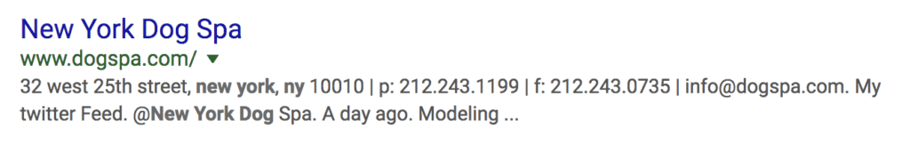
These elements (title tags and meta descriptions) help users understand what each page on the website is about and allow search engines to do the same. Plus, your brand needs a level of professionalism demonstrated in well-crafted language—even on the search engine results page—which is what these elements help do.
Image Descriptions
Image descriptions, or alt tags, provide a text alternative for an image file. Google is smart, but it can’t entirely read images yet. Alt tags give it a description of what the image is, which leads to a better understanding of what the page is about.
In addition, if an image doesn’t load for a user, possibly because the user has a poor internet connection, the alt tag displays instead, so they can still get some of the meaning even without the image.
Responsive Design
Even after designing with mobile in mind, there’s a lot that goes into making a website look great and function smoothly on screens ranging from 2 inches to 60 inches wide. From how menus work to how tables are treated, everything needs to be thought through and tested for mobile. The team building your team will perform these tests to ensure responsive design so you don’t lose prospects because the website doesn’t fit on different screens.
Managing a College Website Post-Launch
When the testing is done, the optimization is complete, and the website is live, there’s still work to be done. Specifically, the administrators who will be handling the site need to know how to manage it.
As we’ve noted several times, the worst thing a college can do to its own website is let it get overgrown.
Two main ways to combat this are:
- A clear structure of who you allow to do what on the website, including robust user management.
- Educating administrators on how to best use the website.
Management includes how (and how not to) use headlines, the college’s messaging strategy implementation, and modern web management practices. Be sure to train on any approval process you set up for managing the new website.
Elevate Your College’s Website with PHOS
A website is the most powerful marketing, branding, and informational tool a college has. With careful planning, a thought-through process, and a good understanding of users and modern web practices, an effective college website can be built.
If you need guidance with creating and executing a plan, PHOS offers an array of web design services. You deserve to have a website that reflects your campus’s unique culture and student experience. With our team’s expertise and experience, your dream college website can be made a reality.
Jenelle Kruse
As a Designer, Jenelle focuses on creating compelling narratives that are communicated creatively and crafted with care. She wakes up every day excited to put forth clients’ vision and story through design that is meaningful and memorable.
In her life outside the studio, Jenelle spends her time chasing around her toddler or watching shows with her husband with a cat on her lap. When she’s not finding time trying to squeeze in a workout, you’ll find Jenelle in the kitchen cooking up treats and meals…or just eating ice cream out of the quart.